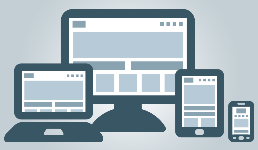
What's "responsive" web design?
When a site is optimized for a desktop, laptop, tablet or phone, that’s responsive web design. It’s more than turning your mobile device on its side—it means that every part of the site that works on a computer, works equally well on any tablet or smartphone, too.
What do we mean by that?
If you’re on a computer, grab the lower right-hand corner of your browser window and watch what happens. If you’re on a tablet or smartphone, pinch or expand the window. See how the information moves to fill the space? That’s responsive web design.
Why it’s important.
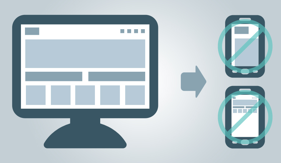
You spent a lot of money on your website. But if a consumer can’t see important information, you could be missing out.
Consumers don’t differentiate what device they’re on, they just expect a site to work. If your site is flawless on a computer, but illegible on a tablet or phone, then you’re missing an opportunity to continue a brand dialogue—and maybe losing out on a sale.
We’re responsive.
We design responsive sites because we like the flexibility it offers. And it means that we gain efficiencies by developing one website, instead of a “computer” site, a “tablet” site and a “mobile” site.
Be more responsive. Now.

Make your brand more responsive.
- Unlock the efficiencies of responsive web design.
- Ensure your brand message is seamless across every device.
- Maintain brand engagement with consumers by providing them with the information they’re looking for when and how they’re looking for it.
Ask us how we can put responsive web design to work for you.
Topics Mobile, Consumer First, What's next, Technology